
Overview
Timeline: 4 Months
My role: Lead Designer
Tasks Done:
- Content Audit
- Stakeholder Interviews
- User interviews
- Information Architecture Generation
- Taxonomy Definition
- Prototyping and testing
- Refining of new visual brand
- Launch
The Problem:
The Prosperity Agenda (TPA) had a manualized curriculum (Family Centered Coaching) that they wanted translated into an online toolkit. While it would’ve been easy to copy the toolkit one for one online, TPA wanted to make a more interactive toolkit by understanding the users’ needs, and structuring the content in a way that made sense online.
The Solution:
A new stand-alone website that housed the clients curriculum for anyone to access.
A new taxonomy that allowed for the creation of new content.
Alignment with the team about curriculum.
Tasks:
- Content Audit
- Stakeholder Interviews
- User interviews
- Information Architecture Generation
- Taxonomy Definition
- Prototyping and testing
- Refining of new visual brand
- Launch
Results:
- New online curriculum
- A well defined taxonomy for new articles
- Updated user flows
- Launching of website
Research
Understanding the Family Centered Coaching Toolkit:
Content Audit:
At the beginning of the project, before kick off, I was given a set of curriculum to understand the content fully. After reading the content, I had several questions such as who was this content geared towards? Did families use it or did their mentors and coaches? I placed these questions to the client to get clarity.
Stakeholder Interviews:
In talking to the client, I learned that there wasn’t true clarity around the audience of the content. While some stakeholders saw the content being used directly with the people they served (families), others saw the content as a “train the trainers” manual. While the curriculum could have served both, it was important to know who was accessing the information online, and what they were doing with siad information. Since we were creating this site from scratch, it was important to do user interviews and understand how they related to the content.
User Interviews:
After presenting to the client about the incongruences with the how the content was used, I suggested we interview users of the current curriculum. Our client conducted trainings all around the country with different agencies and organizations.
I was given a list of organizations and contacts to begin interviews. Throughout the course of the interview, I talked to 7 different organizations and 15 different contacts. While each one had their own approach to using the curriculum, overwhelmingly the response back was that students of the courses used them within the organization. A composite began to form of the users and their goals. They were:
- To provide good services to their clients;
- To shift management’s approach in helping their clients;
- Begin championing organizational change if need be;
I also found that people who took the training were often not the ones that signed up for the training. People who revisited the training materials were often sent their by managers themselves. They usually were middle management that were responsible for leading a team but had little impact on organizational change directly.
User interviews also revealed how they worked with the manual. Instead of referencing specific lessons, they often thought back to their in person training and came looking for worksheets or articles to forward to their colleagues. With this knowledge we knew we had to support the task of:
- Finding specific worksheets and materials;
- Sharing those materials with others;
- Providing context to the materials when others came to the site;
Design
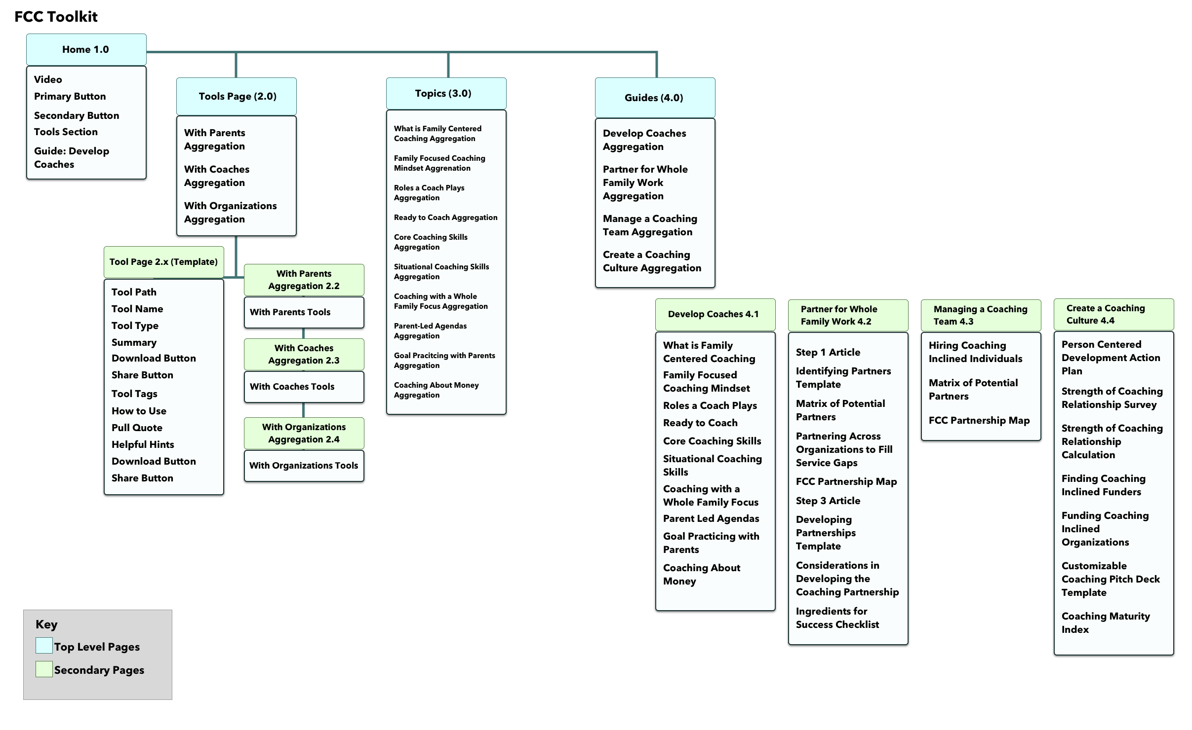
Generating Information Architecture:
In the report back of the user interviews and insights, our client came to the realization that the approach to the online manual would need to change significantly. I began to set to work of designing the website. This would require pulling apart the manual’s structure and putting it back in a way that made sense online. My first iteration of the site architecture took user’s journey’s into mind. How would they be able to access the content quickly? What would they need to navigate the structure of the site successfully. Where should documents included that made sense. After checking in with the client, we refined the sitemap and finalized the architecture of the site.Defining a Taxonomy:
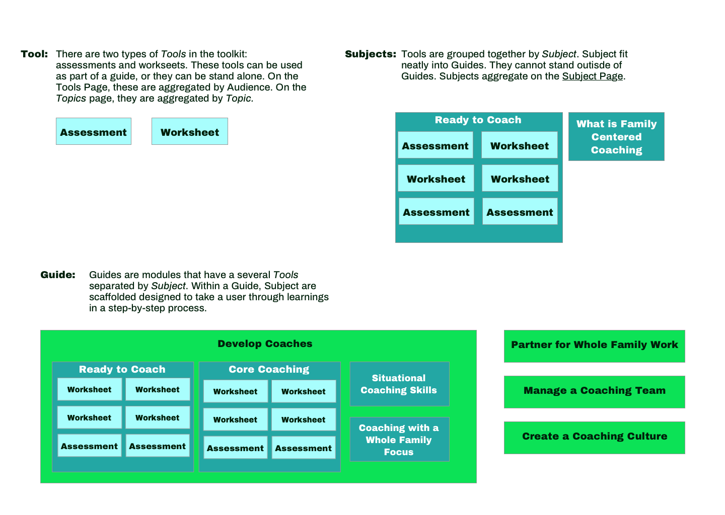
Part of creating a successful sitemap was creating a taxonomy for pages, articles, guides, and subjects that made sense. As we went through this process, I got to understand how the client thought about their work, and how to build upon their own mental model.
Synthesizing and Designing:
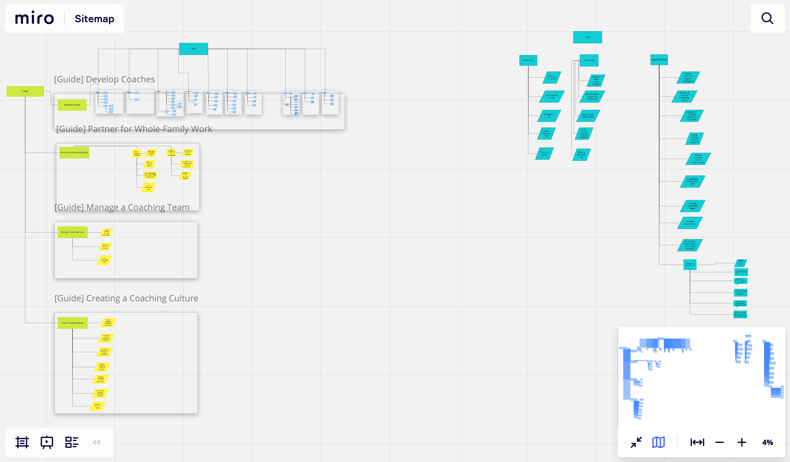
Prototyping and Testing:
With all the behind-the-scenes thinking done, it was time to test the structure of the site. Starting in Sketch, I wireframed the key pages of the site. As a visual designer was brought in, I moved to Adobe XD to have a shared document of which we could work off.

Refining of new visual brand:
With my work done for the most part, I handed off the wireframes and prototype to the developer and the visual designer to keep iterating on visuals. Shifting into more of a consultant role here, my job was to make sure colors and typography did not distract from getting to the information quickly as possible. It was here that the visual designer, the developer, and I laid out which interactions would work well for the site. Over several iterations, we determined the look and feel of the site to test with users.Outcomes
