Overview
Timeline: 1 Year
My role: Lead Designer
Project Summary:
I was brought on to Gay City as their Digital Communications Designer in 2018, my first project was tackling their website that hadn’t been updated since 2011. While there were many things that worked for the website, bloat had caused the website to become convoluted and difficult to navigate.
Over the course of a year, I championed a user-first approach to the website which led to an entire sight revamp. Spearheading the revamp, I became responsible for crafting user research activities, creating user centric designs for mobile and desktop, and working with a distributed team of developers. I also acted as the project manager for this project, overseeing the UX writing for the website.
Research
Getting Started
Gay City hadn’t talked to its clients before about their website usage. Like most community based non-profits, most of the data collection was for satisfying grant requirements, not understanding its own processes. Over the course of a month, I talked with users, internal departments, and stakeholders to understand how they related to the website.
User Surveys
While interviewing, we also placed a top task survey on the site, to get website visitors input.
78% of respondents indicated coming to Gay City’s site for its primary service: HIV testing. Another
16% indicated that they were there for Resources about what to do around Seattle.
This presented an opportunity for Gay City to engage people online to coming in person to their programs.
Interviews
To help round out my research, I interviewed users coming to Gay City’s site. I opted to interview 5 respondents to get a better sense of the following:
- How do Gay City’s services fit into the context of their lives overall?
- When they did people first encounter Gay City services?
- What sets Gay City’s services apart from other services around town?
revealed that people not only came to Gay City to get HIV services and treatment but primarily to connect with Community. People thought of Gay City as a hub to what was going on in Seattle’s Gay Community that wasn’t a bar or nightlife.
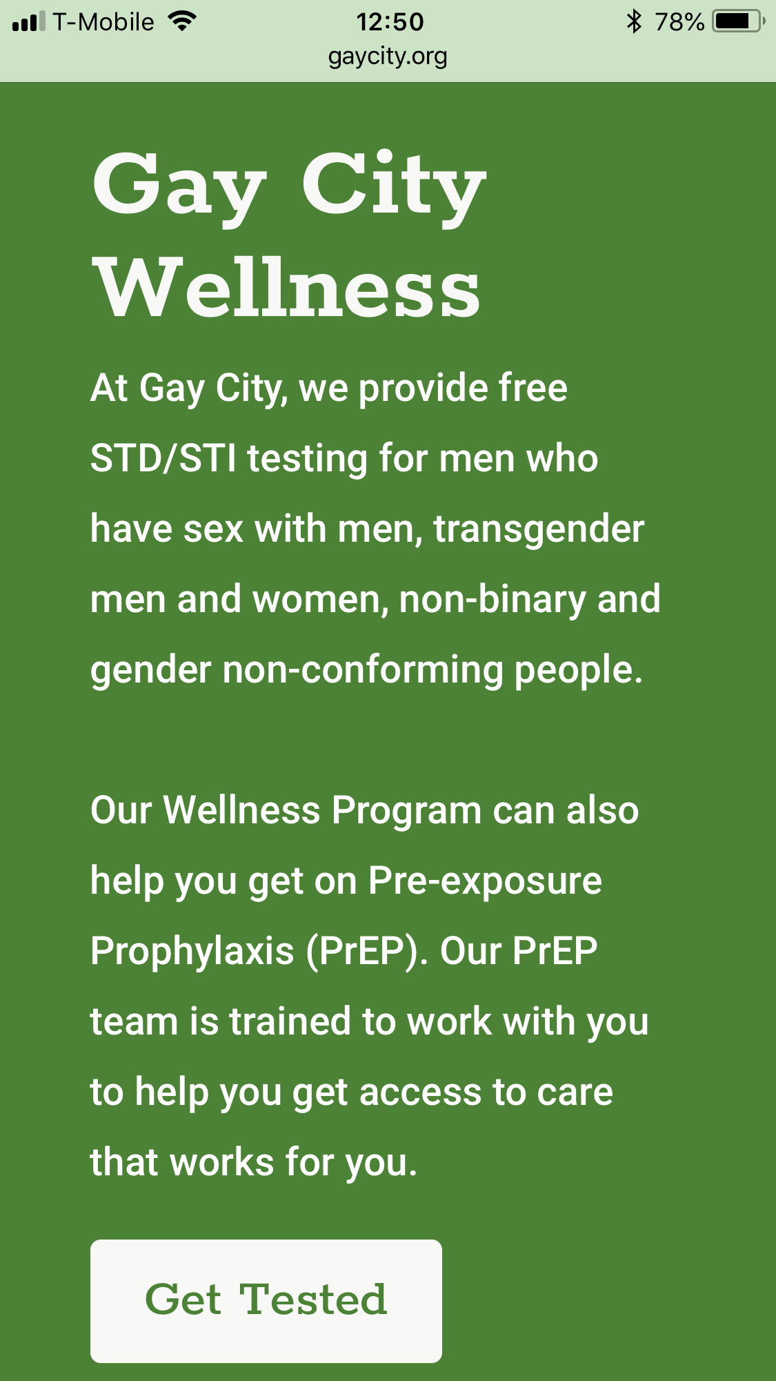
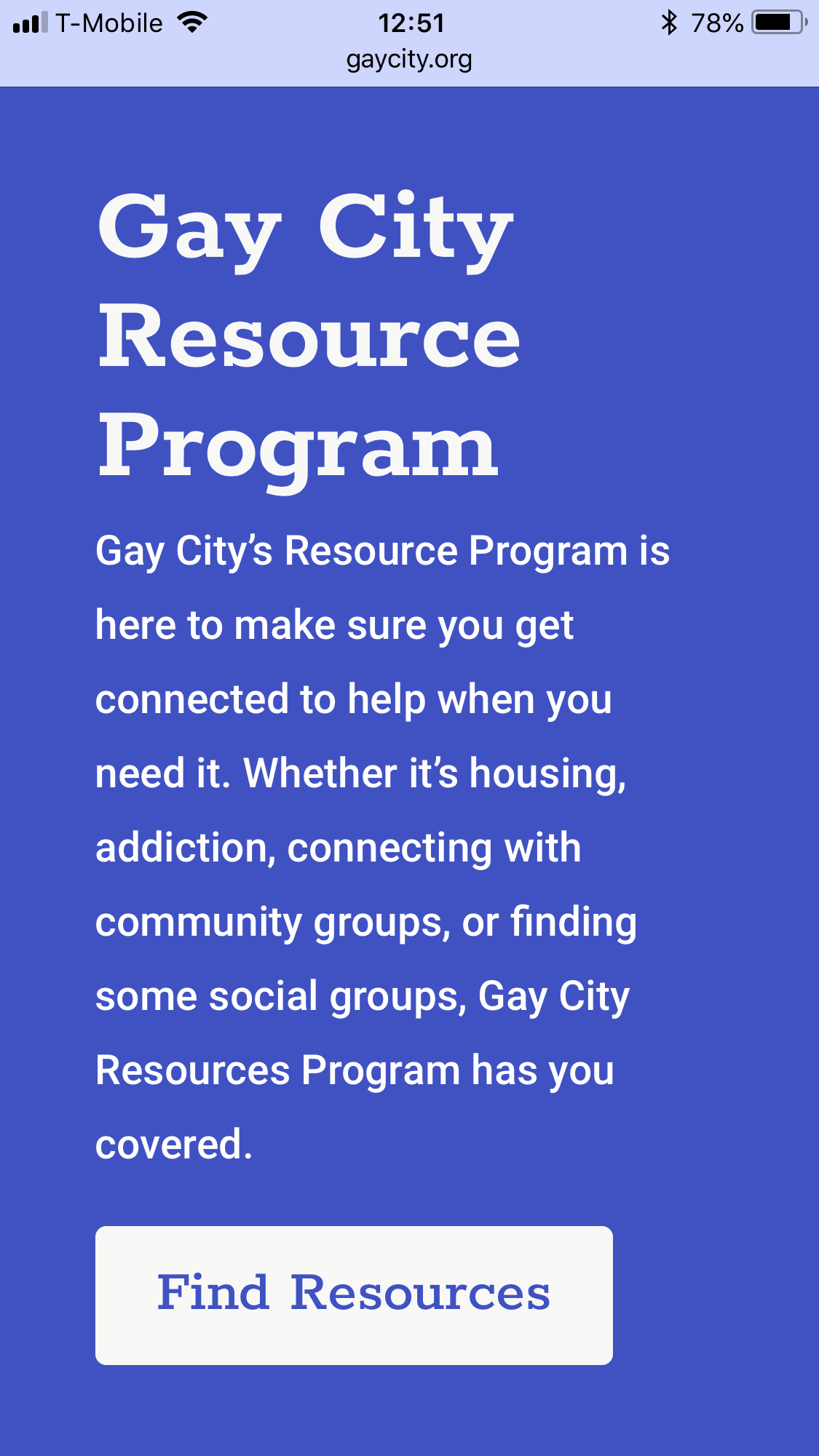
An insight that shone through from the surveys and the interviews was how the lack of mobile responsiveness really hurt Gay City’s website opportunities to continue to connect with their clients.
Design
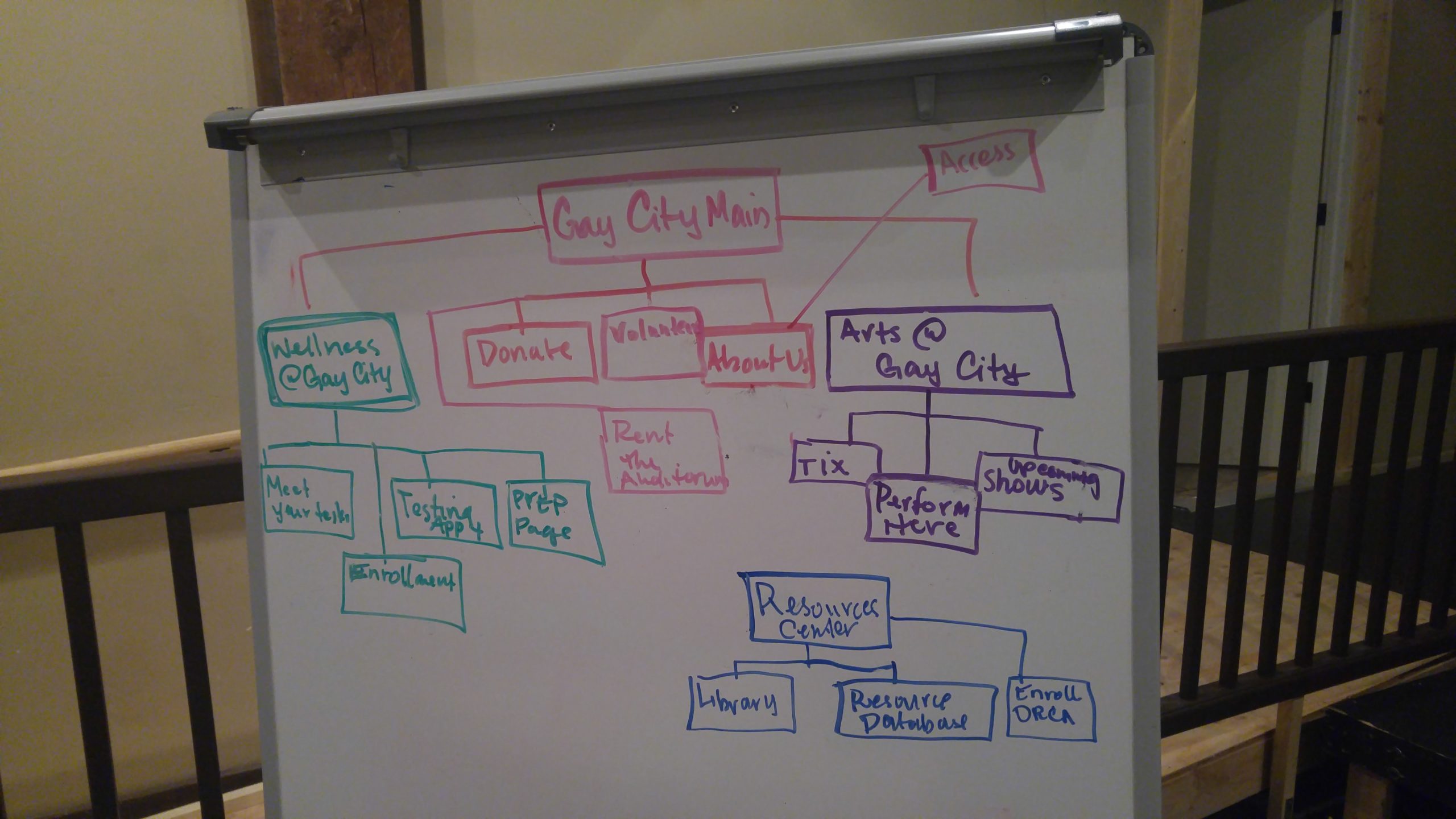
Creating Site Architecture
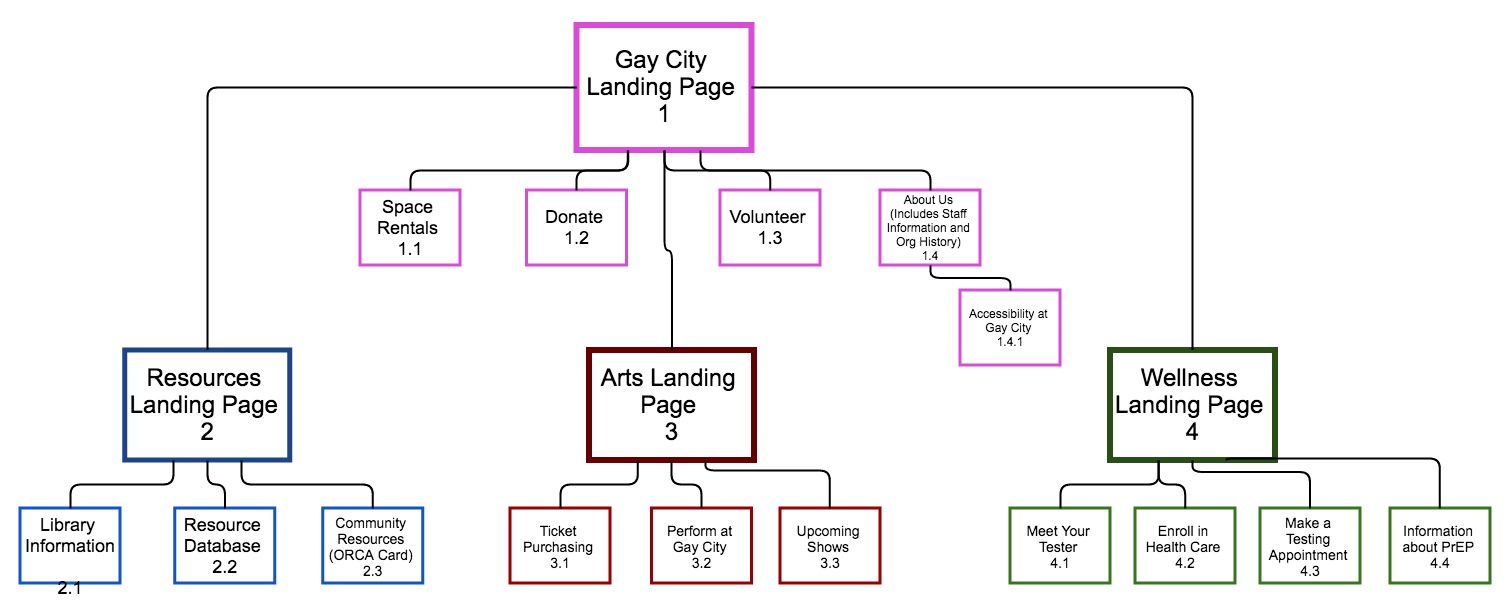
One thing that stood out immediately was that Gay City’s website would need a new architectural structure. While interviewing users, I also took this opportunity to interview internal stakeholders about how they used the website and how they viewed their programming. Using that information, I began identifying what programs needed pages for people to find on the website.
Working with the directors of each department, and then talking to managers and front line workers, I created an architecture that satisfied the needs of each department. With this structure, the website’s architecture reflected the needs of the organization online.
Translating the brand
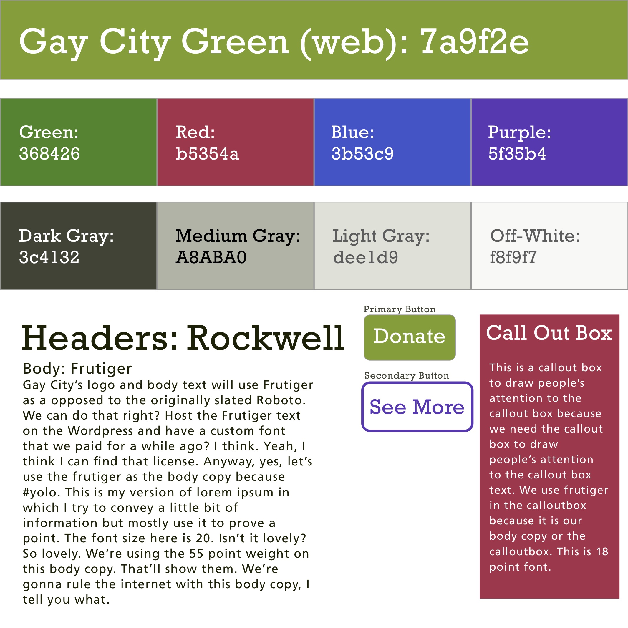
I began creating a visual brand for Gay City’s online presence. During the interviews with Gay City stakeholders, I took time to learn about each department within the organization and what they did. It was there I went about crafting the colors for each Gay City department.
Wireframing Process
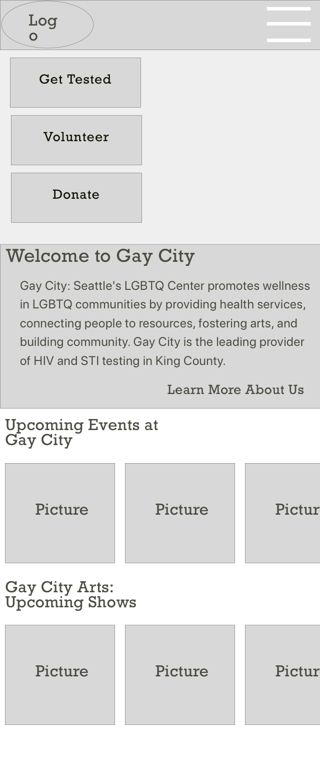
I began working with the Communications Director, and a team of developers, to creating the website. I was task with creating the wireframes for the website itself.
Using a mobile first approach, wireframing helped me prioritize content areas, iterating quickly with feedback from the Comms Director.
Combined with the user insights, we settled on a general flow for pages, and between pages based on user goals.

Outcomes
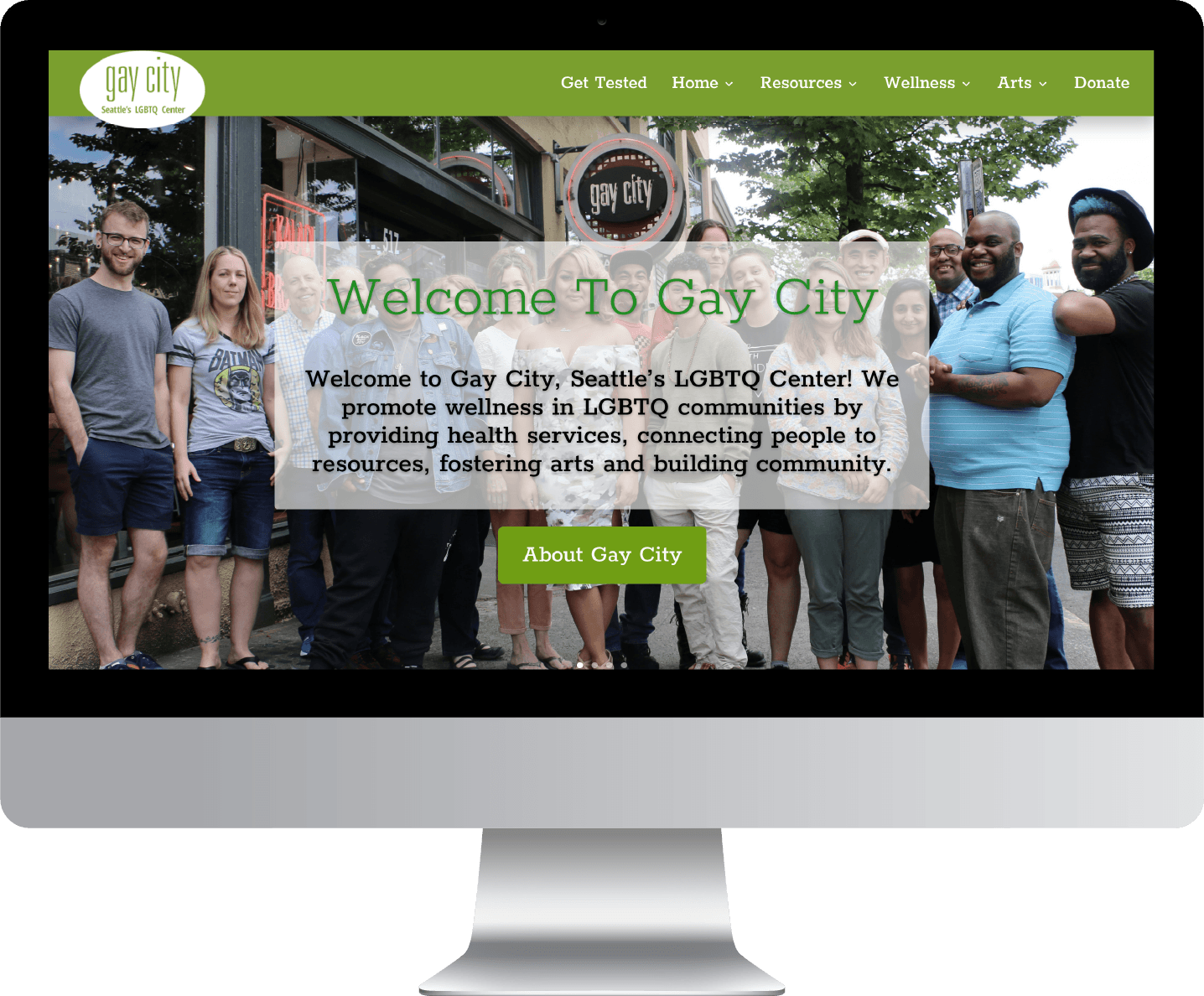
After months of iterating on designs and collaborating organizationally wide, we were able to successfully launch the website a year after starting the work.
The revamped site was mobile friendly, and prioritized user needs. Additionally, the site had brand new metrics for the Comms Director, who was able to use Google Analytics to measure outcomes across the site.
